Resources & campaigns • CARE Package® campaign
CARE Package® campaign
Overview
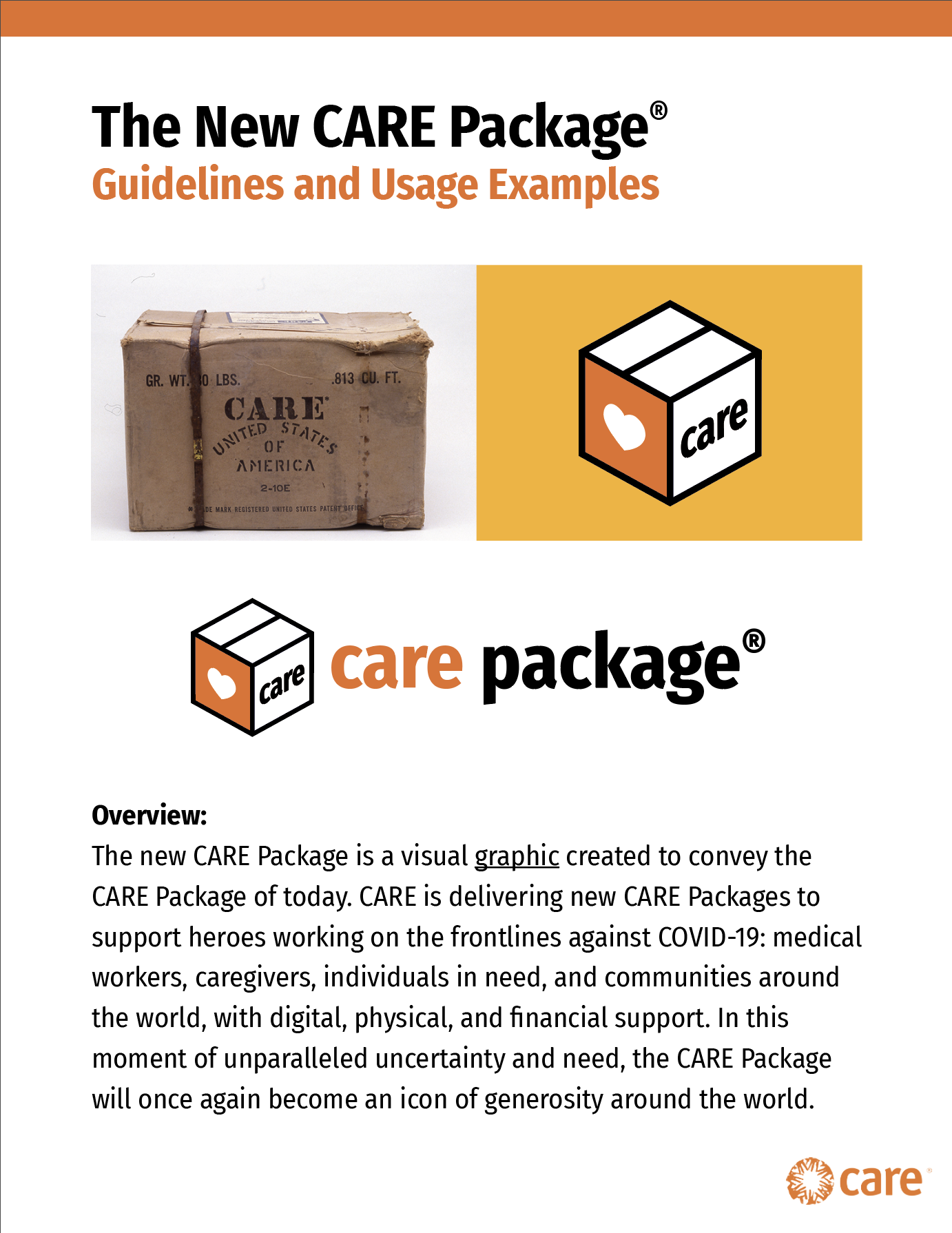
The new CARE Package is a visual graphic created to convey the CARE Package of today. CARE is delivering new CARE Packages to support heroes working on the frontlines against COVID-19: medical workers, caregivers, individuals in need, and communities around the world, with digital, physical, and financial support. In this moment of unparalleled uncertainty and need, the CARE Package will once again become an icon of generosity around the world.
Guidelines
These guidelines provide information and tools for the global reintroduction of the CARE Package.
This guide gives initial guidelines around the visual graphics created so the CARE Package of today has a modern and fresh identity. The guide will be updated with messaging and marketing language over time.
Basic dos and don'ts
What it is:
- The CARE Package is a GRAPHIC and also an ICON.
- It is a product/service of CARE, not its own entity.
What it is NOT:
- It is NOT a logo.
- It does NOT replace the CARE logo.
- It does NOT have its own brand, CARE is the parent brand.
Do:
- Follow these guidelines and reach out to Brand Support with Q’s.
- Use the appropriate graphic on approved background colors.
- Always have the CARE logo present on collateral.
- Reference this site for info on the brand guidelines.
Don’t:
- Do not edit the graphic or icon. We need global consistency.
- Do not create your own versions of the graphic/icon.
- Do not use the graphic on colors other than outlined in the guidelines.
Graphic variations
Main graphic:

*More colorway options are in the full guidelines, but this is the preferred Main Graphic.
Stacked graphic

*More colorway options are in the full guidelines, but this is the preferred Stacked Graphic.
CARE Package icon
*More colorway options are in the full guidelines, but this is the preferred CARE Package Icon.
Branding the graphic with the CARE logo
Examples and guidelines
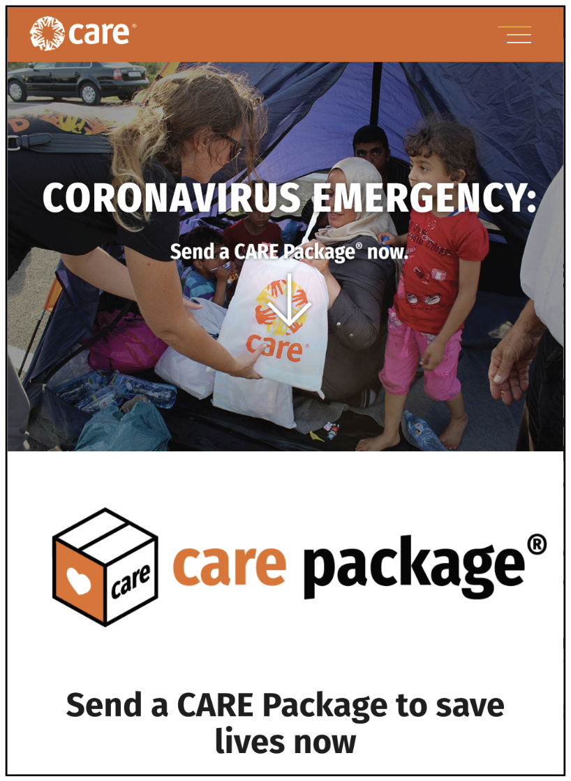
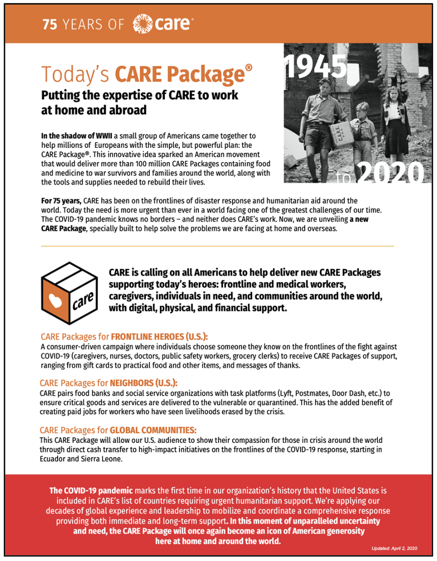
The CARE logo should always lead. The graphic is not a logo, so the CARE logo should always be present, but the two should be as far apart as possible.
The CARE Package should be featured as the main product/service we are promoting. Therefore it can have a large prominence, even bigger than the CARE logo. The logo just needs to appear as it normally does...in headers, in footers, in the top navigations of websites, etc. Please refer to these examples as a guide.
At this time, do NOT co-brand the graphic with the CARE logo.*

Examples of good use cases

The graphic over photography
Examples
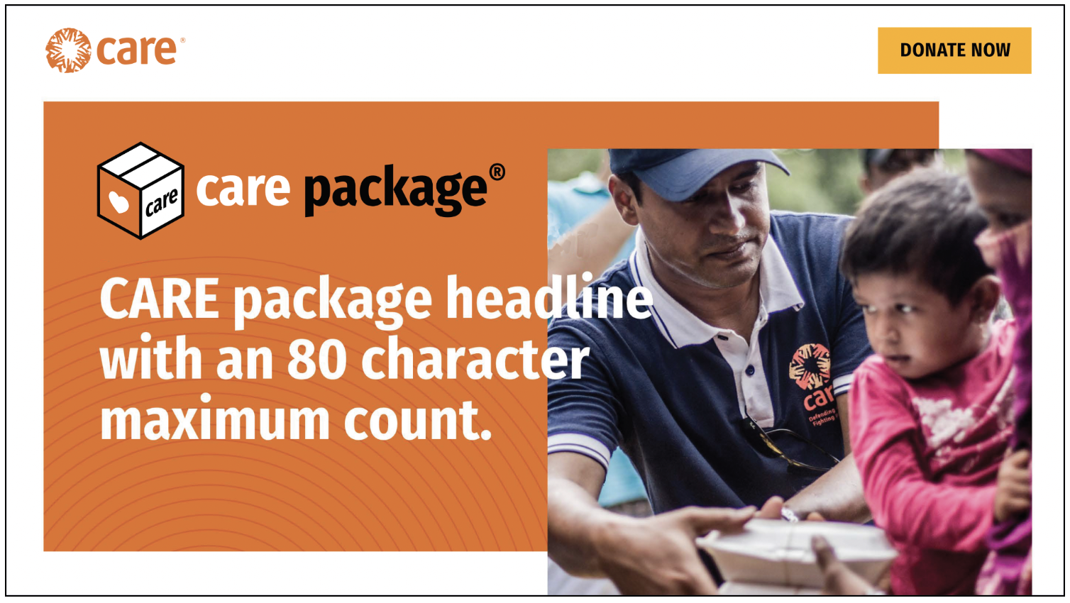
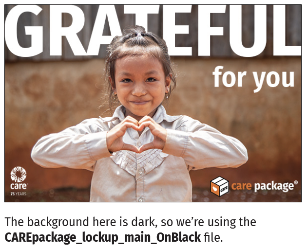
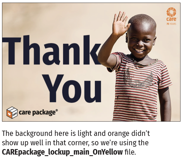
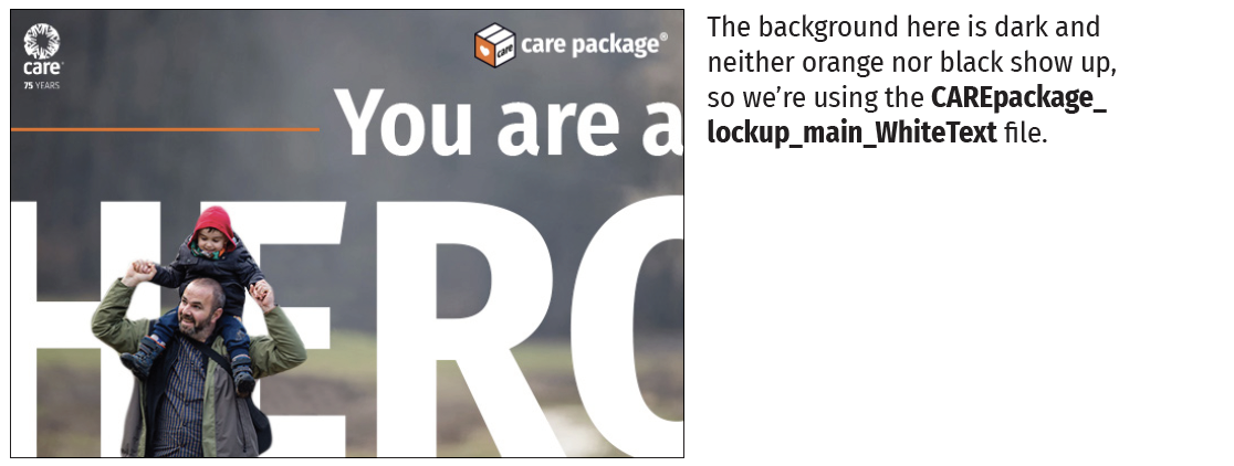
Use the graphic that is best visible over the photo.
You can use any of the graphic variations provided on top of photos. The preference is to use one of the full color variations with orange, black and white. If you have a dark photo, you may want to use the graphic with white text. If you have a photo where the orange text isn’t readable, you may want to use the black text version. Reserve the all-white and all-black variations for when no other option works.
Resources
Campaigns
CARE Package®
DOWNLOAD
CARE Package Guidelines
PDF file
CARE employees and approved partners can contact brandsupport@care.org for the password to access downloadable materials.
DOWNLOAD
CARE Package Graphics
EPS and PNG files
CARE employees and approved partners can contact brandsupport@care.org for the password to access downloadable materials.
Presentation: History of the CARE Package
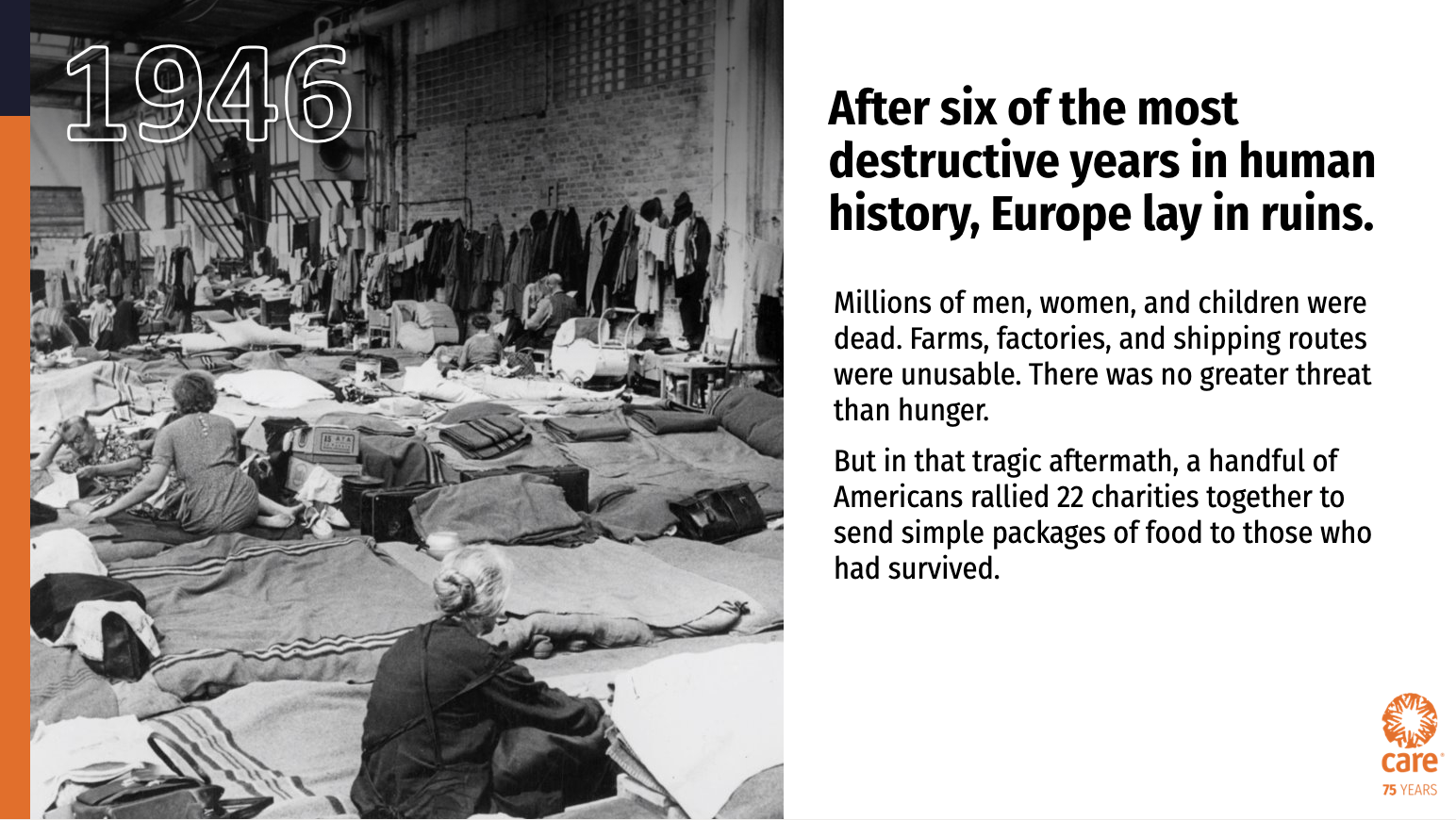
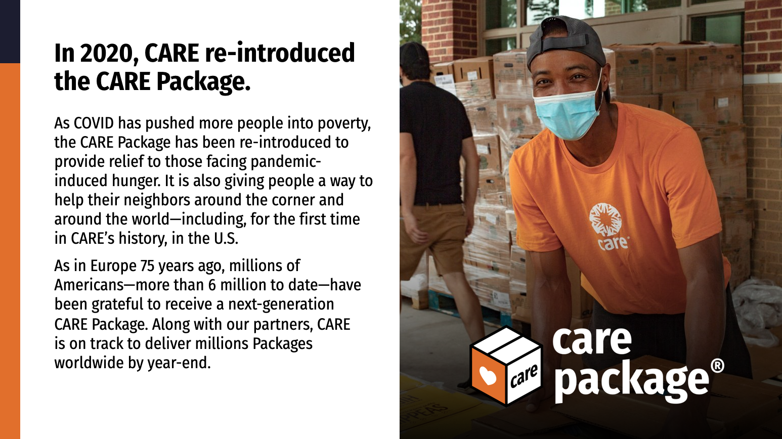
This presentation provides a brief history of the CARE Package, from its beginnings in 1946 to its reintroduction in 2020 during the COVID-19 pandemic.
DOWNLOAD
Presentation: History of the CARE Package
(PPT & PDF)
CARE employees and approved partners can contact brandsupport@care.org for the password to access downloadable materials.
Resources & campaigns • CARE Package® campaign
CARE Package® campaign
CARE Brand Quick Guide | CARE Storytelling Guide | CARE Overview PowerPoint | CARE Annual Report | CARE Fact Sheet | CARE messaging posters | CARE Zoom backgrounds | CARE Package®
Overview
The new CARE Package is a visual graphic created to convey the CARE Package of today. CARE is delivering new CARE Packages to support heroes working on the frontlines against COVID-19: medical workers, caregivers, individuals in need, and communities around the world, with digital, physical, and financial support. In this moment of unparalleled uncertainty and need, the CARE Package will once again become an icon of generosity around the world.
Guidelines
These guidelines provide information and tools for the global reintroduction of the CARE Package.
This guide gives initial guidelines around the visual graphics created so the CARE Package of today has a modern and fresh identity. The guide will be updated with messaging and marketing language over time.

Basic dos and don'ts
What it is:
- The CARE Package is a GRAPHIC and also an ICON.
- It is a product/service of CARE, not its own entity.
What it is NOT:
- It is NOT a logo.
- It does NOT replace the CARE logo.
- It does NOT have its own brand, CARE is the parent brand.
Do:
- Follow these guidelines and reach out to Brand Support with Q’s.
- Use the appropriate graphic on approved background colors.
- Always have the CARE logo present on collateral.
- Reference this site for info on the brand guidelines.
Don’t:
- Do not edit the graphic or icon. We need global consistency.
- Do not create your own versions of the graphic/icon.
- Do not use the graphic on colors other than outlined in the guidelines.
Graphic variations
Main graphic

*More colorway options are in the full guidelines, but this is the preferred Main Graphic.
Stacked graphic

*More colorway options are in the full guidelines, but this is the preferred Stacked Graphic.
CARE Package icon
*More colorway options are in the full guidelines, but this is the preferred CARE Package Icon.
Branding the graphic with the CARE logo
Examples and guidelines
The CARE logo should always lead. The graphic is not a logo, so the CARE logo should always be present, but the two should be as far apart as possible.
The CARE Package should be featured as the main product/service we are promoting. Therefore it can have a large prominence, even bigger than the CARE logo. The logo just needs to appear as it normally does...in headers, in footers, in the top navigations of websites, etc. Please refer to these examples as a guide.
At this time, do NOT co-brand the graphic with the CARE logo.*

Examples of good use cases


The graphic over photography
Examples
Use the graphic that is best visible over the photo.
You can use any of the graphic variations provided on top of photos. The preference is to use one of the full color variations with orange, black and white. If you have a dark photo, you may want to use the graphic with white text. If you have a photo where the orange text isn’t readable, you may want to use the black text version. Reserve the all-white and all-black variations for when no other option works.


DOWNLOAD
CARE Package Guidelines
PDF file
CARE employees and approved partners can contact brandsupport@care.org for the password to access downloadable materials.
DOWNLOAD
CARE Package Graphics
EPS and PNG files
CARE employees and approved partners can contact brandsupport@care.org for the password to access downloadable materials.
Presentation: History of the CARE Package
This presentation provides a brief history of the CARE Package, from its beginnings in 1946 to its reintroduction in 2020 during the COVID-19 pandemic.


DOWNLOAD
Presentation: History of the CARE Package
(PPT & PDF)
CARE employees and approved partners can contact brandsupport@care.org for the password to access downloadable materials.
