Brand standards • Graphics standards • The brandmark
The brandmark
The CARE logo
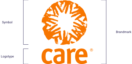
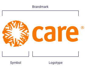
The brandmark is the most visible element in the CARE brand identity system. It consists of the symbol (the “Community of Hands”) and the CARE logotype. The proportional relationship between the symbol and the CARE logotype should never be altered. The two elements must always appear together exactly as shown here, never separately.
The vertical configuration of the CARE brandmark displayed below is the preferred version of the brand mark for all applications. The horizontal configuration of the CARE brandmark is the alternate version of the brandmark and should be used in applications where space is unavoidably limited. If your layout requires the use of the brandmark, use the files provided. Do not build your own.
Licensing the mark
In cases where a third party would like to use a CARE mark, it is critically important to have a licensing agreement in place. Whether for a small community fundraiser or a multi-national partnership, a licensing agreement protects and prescribes the use of the marks. When presented with an opportunity that requires third-party use of any CARE mark, contact brandsupport@care.org or legal@care.org.
Brandmark options
The following two logo options are the only approved color variations of the logo. Do not under any circumstances: alter the logo in any way, change the colors, use the logo in black (except when printing in black and white), distort the logo, put the logo on a background that makes it unreadable, or separate the circle of hands from the wordmark. Please find more examples of incorrect brandmark applications at the bottom of the page.
The White logo on an orange or solid background is preferred and should be used whenever possible. When it is not possible, you can use the Orange version on white.


DOWNLOAD
CARE Logo (SVG and PNG files)
CARE employees and approved partners can contact brandsupport@care.org for the password to access downloadable materials.
Brandmark clear space and minimum size
Clear space
Clear space is the minimum area to be kept free of graphics, logos, type, lines or any other elements around the logo. No other graphic elements or type should appear within this area with the exception of the tagline or website lockup.
Make sure the CARE logo always has an appropriate amount of clear space around it. This ensures that no other visual elements compete with or hide the logo.
The clear space is determined by the height of the “e” in the CARE logotype below. This measurement is then applied all around the brandmark.


Minimum size
To ensure legibility, do not use the mark smaller than .25” wide

Brandmark on color backgrounds and images
Logo use on color backgrounds
Do not use the brandmark on any color background that does not allow the brandmark to be clearly visible.
- First preference: Use the White logo on the CARE Orange background.
- Second preference: Use the Orange logo on a White background.
Generally, we advise using the logo only on CARE's Primary and Secondary colors. However, there may be exceptions. For instance, in Emergency collateral, the white CARE logo may appear on Red or Black backgrounds. Additionally, when co-branding with partner organizations, the logo may be used on different colors.
If an external partner is using our logo, please submit these cases to brandsupport@care.org for approval.


Not enough contrast between the background and logo.
The orange version of the logo creates more contrast between the background.
Logo use on images
When placing the CARE brandmark on an image, take care to place it in a manner that ensures readability and contrast with the background. Do not place the brandmark on an image in a way that obscures essential details of the image.
Do not place the brandmark in a box to create contrast between the brandmark and the image. If there is no suitable location on an image to superimpose the brandmark, select a different image.


C4 CARE ACTION DIFFERENTIATION
Primary Logo treatment - WHITE ON ORANGE
Secondary Logo treatment - ORANGE ON WHITE


Co-branding
Co-branding links the brand credibility of CARE to that of another entity for the mutual promotional benefit of both. Co-branding is about more than just the placement of logos; it is about a business relationship between CARE and another organization. For all instances of co-branding, we select partners who share our aims and values.
The arrangement of the CARE logo with those of our partner(s) can be in a horizontal row or a vertical column, equally proportioned, with sufficient clear space between them. When our logo is used in association with a product, the same rules of clear space and relative size apply.
Take care to reflect the nature of the relationship between CARE and the partner organization.
If CARE is the primary brand, try to use our corporate typefaces for text, choose colors from our color palette and select images that reflect our style and words that fit our tone of voice. Where the partner brand is dominant, the absolute minimum requirement is the correct reproduction of our logo. When the partnership is equal, marks should be of equal size and typefaces and colors should be as brand neutral as possible.
If a third party wishes to use the co-branded mark, a licensing agreement is required. Please contact brandsupport@care.org or legal@care.org for more information.
NOTE: The creation of any co-brand or sub-brand, including mail programs, partnerships or organizational initiatives, must be reviewed by the Brand Management Team and Legal Department, and be approved by the Senior Director of Brand. There is no exception to this requirement.
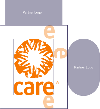


Appropriate clear space around the logo.

Appropriate clear space around the logo.

Not enough clear space under the logo.
DOWNLOAD
CARE Action Logos
(SVG and PNG files)
CARE employees and approved partners can contact brandsupport@care.org for the password to access downloadable materials.
Examples of incorrect brand usage
Never break the logo
The brandmark should not be altered in any way, and especially important is to not separate the circle of hands illustration from the word 'care.' This includes using the circle of hands as an icon which is not allowed, or using it large like a design element.


Incorrect brandmark applications

Don't distort the brandmark.

Don't apply the brandmark on colors or backgrounds where it can not be clearly seen.

Don't use the logotype within text. CARE appears as all caps in headlines and body copy.

Don't add typography or graphics to the brandmark in place of the web address or tagline.

Don't place the brandmark in a field of white or color that creates an impression that it is part of the brandmark.

Don't use brandmark elements in other applications.

Don't alter the symbol or logotype of the brandmark.

Don't alter the color of the brandmark.

Don't alter the construction of the brandmark.

Don't use the retired two-toned logo.

Don't use the symbol without the logotype with it.

Don't use the circle of hands as a design element.
