Brand standards • Graphics standards • Color palette
Color palette
What's new
We've integrated new colors into our palette, alongside adaptations of our existing ones, creating a more modern system that includes beautiful gradients for added depth and dimension. The Yellow has been removed from the palette.
Colors
Orange is CARE's primary color, essential for impact, recognition, and consistency in our branding. Indigo and Purple serve as secondary colors, supporting the primary brand color. Lilac and Blush should be used sparingly for accents and highlights. Cream remains a great neutral background to complement the overall color scheme.
Primary
Orange
#F77600
R247 G118 B0
C0, M66, Y100, K0
PMS 151C
For website developers only
WCAG & ADA approved Orange: #EB7100
Secondary
Indigo
Purple
#241E4E
R36, G30, B78
C97, M98, Y37, K36
PMS 281C
#5C2163
R92, G33, B99
C73, M100, Y29, K18
PMS 2613C
Tertiary / Accents
Lilac
Blush
#BF7CB5
R191, G124, B181
C24, M60, Y0, K0
PMS 521C
#FFD1D3
R255, G209, B211
C0, M22, Y8, K0
PMS 503C
Neutrals
Cream, Light grey
Emergency colors
Red, Rich black
#FFF8EE
R255, G248, B238
C0, M2, Y5, K0
PMS P 1-9 C
#E10917
R225, G9, B23
C2, M100, Y99, K0
PMS 186C
#F9F6F4
R249, G246, B244
C1, M2, Y2, K0
PMS Cool Grey 1C
#090015
R9, G0, B21
C78, M75, Y59, K81
PMS Black C
Brand standards • Graphics standards • Color palette
Color palette
What's new
We've integrated new colors into our palette, alongside adaptations of our existing ones, creating a more modern system that includes beautiful gradients for added depth and dimension. The Yellow has been removed from the palette.
Colors
Orange is CARE's primary color, essential for impact, recognition, and consistency in our branding. Indigo and Purple serve as secondary colors, supporting the primary brand color. Lilac and Blush should be used sparingly for accents and highlights. Cream remains a great neutral background to complement the overall color scheme.
Primary
Orange
#F77600
R247 G118 B0
C0, M52, Y100, K3
PMS 151C
For website developers only
WCAG & ADA approved Orange: #EB7100
Secondary
Indigo
#241E4E
R36, G30, B78
C54, M62, Y0, K69
PMS 281C
Purple
#5C2163
R92, G33, B99
C7, M67,Y0, K61
PMS 2613C
Tertiary / Accents
Lilac
#BF7CB5
R191, G124, B181
C0, M35, Y5, K25
PMS 521C
Blush
#FFD1D3
R255, G209, B211
C0, M18, Y17, K0
PMS 503C
Neutrals
Cream
#FFF8EE
R255, G248, B238
C0, M3, Y7, K0
PMS P 1-9 C
Light grey
#F9F6F4
R249, G246, B244
C0, M1, Y2, K2
PMS Cool Grey 1C
Emergency
Red
#E10917
R225, G9, B23
C0, M96, Y90, K12
PMS 186C
Rich black
#090015
R9, G0, B21
C57, M100, Y0, K92
PMS Black C
Color usage
Orange is our primary color and should be included in every color combination. Indigo and Purple are our secondary colors.
Lilac should only be used as an accent color on top of Indigo. Lilac should not be used as a solid background.
Blush should only be used as an accent on top of Purple. Blush should not be used as a solid background.
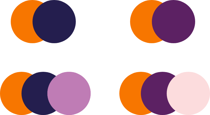
Color dos

Do use Indigo to pair with our CARE Orange.

Do use Purple to pair with our CARE Orange.

Do use Lilac as an accent on Indigo.

Do use Lilac as an accent on Purple.

Do only use white text on CARE Orange.

Do only highlight words in CARE Orange.

Do only highlight words in CARE Orange.

Do use contrasting colors from our color palette on the neutral backgrounds
Color don'ts

Don't use the retired Yellow color.
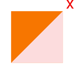
Don't use Blush as a secondary color.

Don't use non-contrasting colors for text.
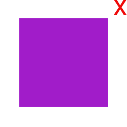
Don't use colors not included in our palette.

Don't use black text on CARE Orange.
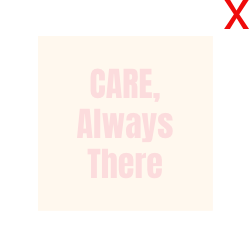
Don't use non-contrasting colors for text.

Don't use Lilac as a secondary color.

Don't use text highlights other than CARE Orange.
