Brand standards • Graphics standards • Circle of CARE guidelines
Circle of CARE guidelines
The Circle of CARE is a powerful emblem of unity and connection within our community. Beyond representing our cooperative values, it embodies our commitment to fostering meaningful relationships across all levels.
The Circle of CARE was thoughtfully designed as part of our brand refresh, drawing inspiration from our existing logo. This versatile graphic element can be seamlessly incorporated into various brand communications, adding an elegant touch of simplicity and sophistication.
We invite you to explore the guidelines in the downloadable interactive PDF to understand how to effectively use the Circle of CARE in our brand communications.
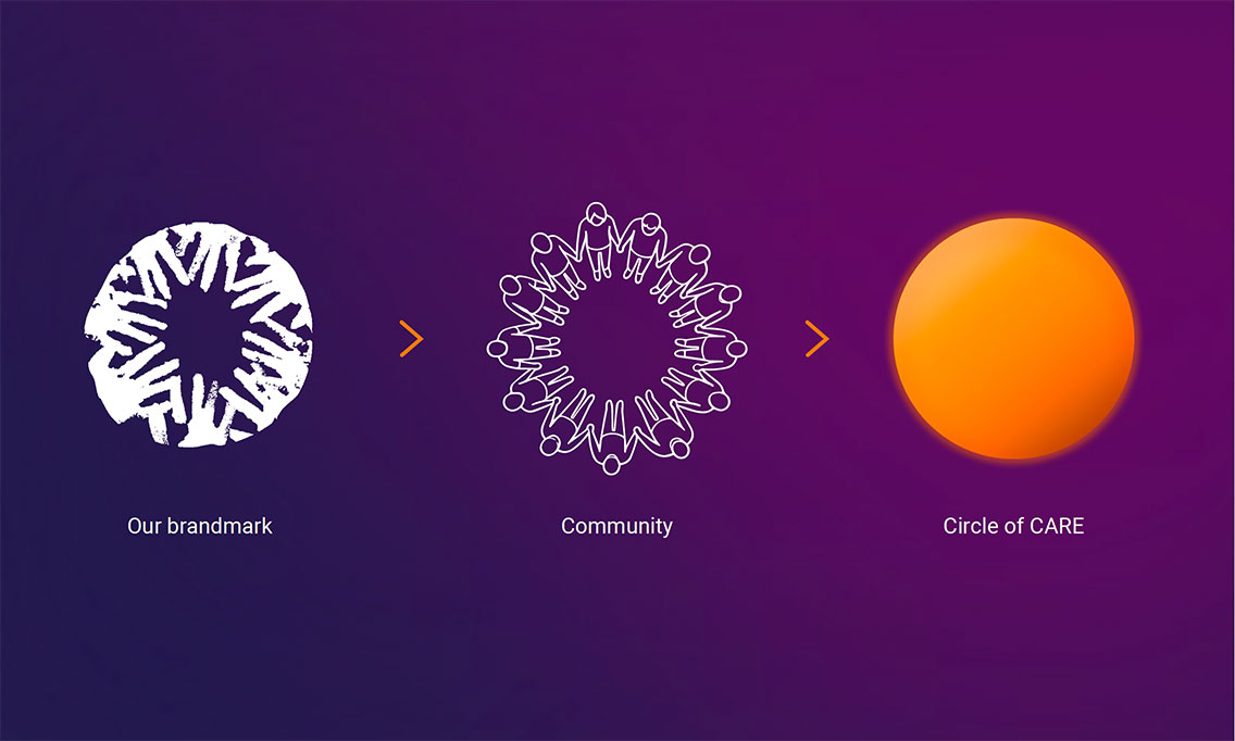
Circle of CARE usage
General don'ts
The Circle of CARE will be used in our brand as a glowing background element for title slides, landscapes, and photographic portraiture. The circle is designed as a spotlight. Highlighting powerful program participants and leaders in our network of CARE. Following these guidelines ensures it remains impactful, enhancing our messaging without distraction. Use the circle thoughtfully to spotlight our mission and those we serve, preserving its integrity and purpose across all communications.

Don’t refer to the Circle of CARE as a sun.

Don’t use the circle alone. It should be used with photography or text.

Don’t add additional design elements to the circle.

Don’t change the color of the circle.

Don’t create your own variation of the circle, only use the file provided on the brand standards site.

Don’t add additional drop shadow to the circle.
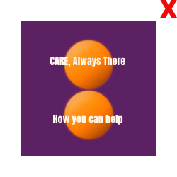
Don’t use more than one circle per page, image, or spread.

Don’t use the circle as a pattern.
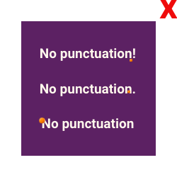
Don’t use the circle as a punctuation. For example; a period, bullet point, or the tittle of an ‘i’ or ‘j’.

Don’t right or left align the circle. It should always be centered within the frame or centered behind a subject.
Photography dos
When using the circle brand element with photography, keep it impactful yet simple. Here, we offer guidance on how to integrate the circle to complement, not overshadow, your subjects. These best practices ensure the circle highlights key elements, creating a balanced and cohesive brand presence.
Here are examples of approved uses of the Circle of CARE.

Cutouts: Do overlay a cutout portrait over the circle. The portrait should be centered within the circle.

Portraits: Do properly scale the circle behind the subject with a sufficient amount of the image background visible.

Group images: Do center the circle behind an entire group of people.

Landscape images: Do crop half of the circle behind the landscape. The full circle should still fit in the image frame behind the landscape.

Pillar highlight: Do use the circle to highlight subjects that directly relate to our pillars.

Pillar highlight: Do use the circle to highlight subjects that directly relate to our pillars.
Photography don'ts
To maintain clarity and impact, here are highlights common misuses of the circle brand element in images. Follow these guidelines to avoid cropping people awkwardly, blocking faces, over scaling, or placing the circle in ways that detract from the intended message. Keeping the design clean and balanced ensures that the circle remains a powerful and effective brand tool.
Here are examples of misuse of the Circle of CARE.

Cutouts: Don’t crop people within the circle.

Portraits: Don’t scale the circle to resemble religious symbolism or elements.

Portraits: Don’t over scale the circle. Some of the background should still be visible.

Group images: Don’t block faces when using the circle behind a group of people.

Group images: Don’t use more than one circle in an image, layout, or spread.

Landscape: Don’t use the circle as a sun in landscape imagery. At least half of the circle should be cropped by the landscape.
Text dos
When in doubt, keep it simple. The Circle of CARE should highlight specific topics, people, or elements without overwhelming the design. Avoid adding logos, excessive text, decorative effects, or complex layouts within the circle to maintain clarity. Stick to clean, straightforward applications to keep the Circle of CARE focused and impactful.
Here are examples of approved uses of the Circle of CARE.

Fonts: Do overlay Anton or Impact (for Microsoft Office programs) on top of the circle.
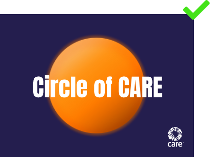
CARE logo: Do include the CARE logo on the same page as the Circle of CARE.

Alignment: Do vertically and horizontally center all of the text to the circle.

Word count: Do limit your headlines to two lines of text and your subheads to one line of text.
Text don'ts
Here are examples of misuse of the Circle of CARE.

Don’t place the CARE logo in the circle.

Don’t use the Circle of CARE as a logo mark.

Don’t outline the circle with text.

Don’t include an entire paragraph of text on the circle.

Don’t crop text within the circle.

Don’t add a drop shadow to text overlaid on the circle.
DOWNLOAD
Circle of CARE Guidelines (PDF file)
and Circle of CARE (PNG file)
CARE employees and approved partners can contact brandsupport@care.org for the password to access downloadable materials.
