Brand standards
Why we need standards & why the update
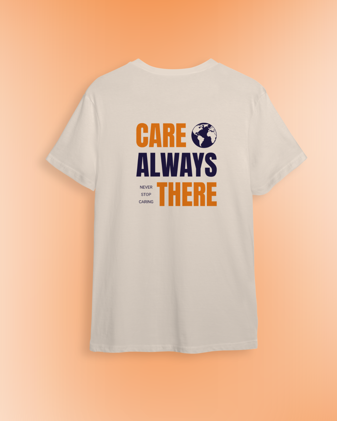
CARE's brand is the face of the organization and represents who we are and what we do. Correct use of the CARE brand — including words, images, graphics, the logo, colors, and typography — is fundamental to maintaining the integrity of the CARE name. Therefore, words and messages on this site were carefully chosen to support CARE's brand.
The protection of CARE's trademarks is similarly important. Proper licensing and monitoring ensure the health of these valuable intellectual property assets and allow CARE to defend against infringement.
These standards are a resource and reference tool for CARE staff and suppliers, providing an overview that helps us correctly use CARE’s brand internally and externally. When necessary, these standards will be updated to ensure that they complement the evolution of CARE.
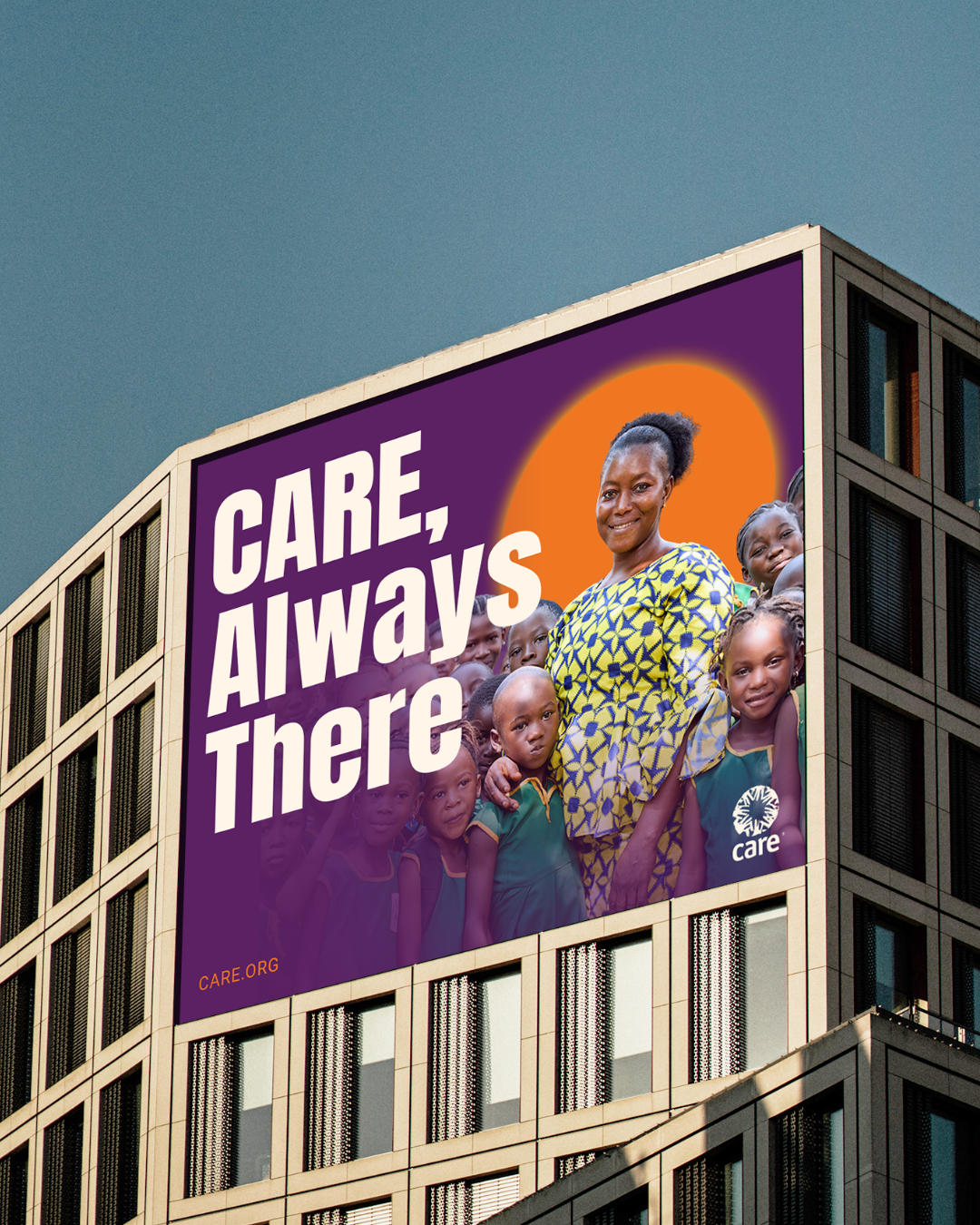
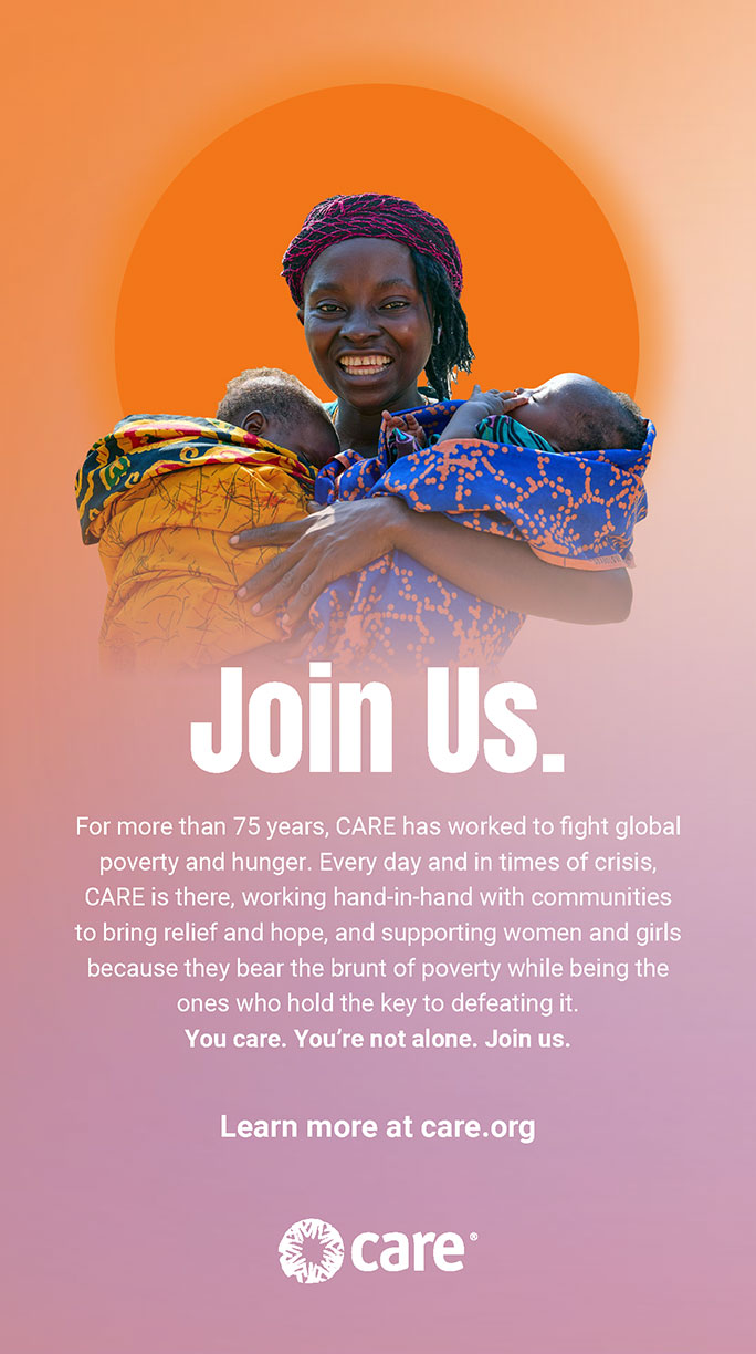
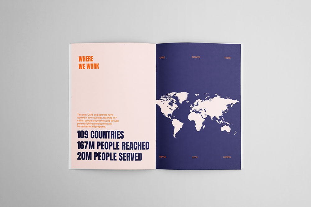
Brand in action