Brand standards • Web style guide
Web style guide
These guidelines are for anyone creating a website using the CARE brand.
Type styles
Fonts
Use the fonts listed in our typography page.
Detailed font sizes for web use below:
HEADLINE 1
Font: Anton / Size: 116px / Line height: 112%
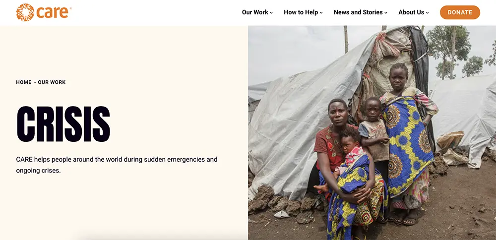
Can be used in all caps sparingly, such as for top inner pages like "OUR WORK" or "CRISIS"
Headline 2
Font: Anton / Size: 48px / Line height: 115%
Headline 3
Font: Roboto Ultra-Bold / Size: 36px / Line height: 125%
Headline 4
Font: Roboto Bold / Size: 28px / Line height: 125%
Headline 5
Font: Roboto Medium / Size: 16px / Line height: 120%
Large intro text and pull quotes
Font: Shippori Mincho / Size: 36px / Line height: 140%
Body copy
Font: Roboto / Size: 19px / Line height: 165%
This is example body copy text. Lorem ipsum dolor sit amet, consectetur adipiscing elit. Fusce consectetur tincidunt ornare. Cras non sapien sem. Morbi non lorem semper, interdum nulla consectetur, ultricies diam. Aliquam in erat nec nulla eleifend pellentesque.
Caption
Font: Roboto / Size: 16px / Line height: 120%
This is example caption text. Lorem ipsum dolor sit amet, consectetur adipiscing elit. Fusce consectetur tincidunt ornare. Cras non sapien sem. Morbi non lorem semper, interdum nulla consectetur, ultricies diam. Aliquam in erat nec nulla eleifend pellentesque.
EYEBROWS / BREADCRUMBS
Font: Roboto Bold / Size: 14.5px / Line height: 140%
This style can be used in all caps
TAGS / FORM FIELD LABELS
Font: Roboto / Size: 12px / Line height: 140%
This style can be used in all caps
Selected text

Link styles
In-line links


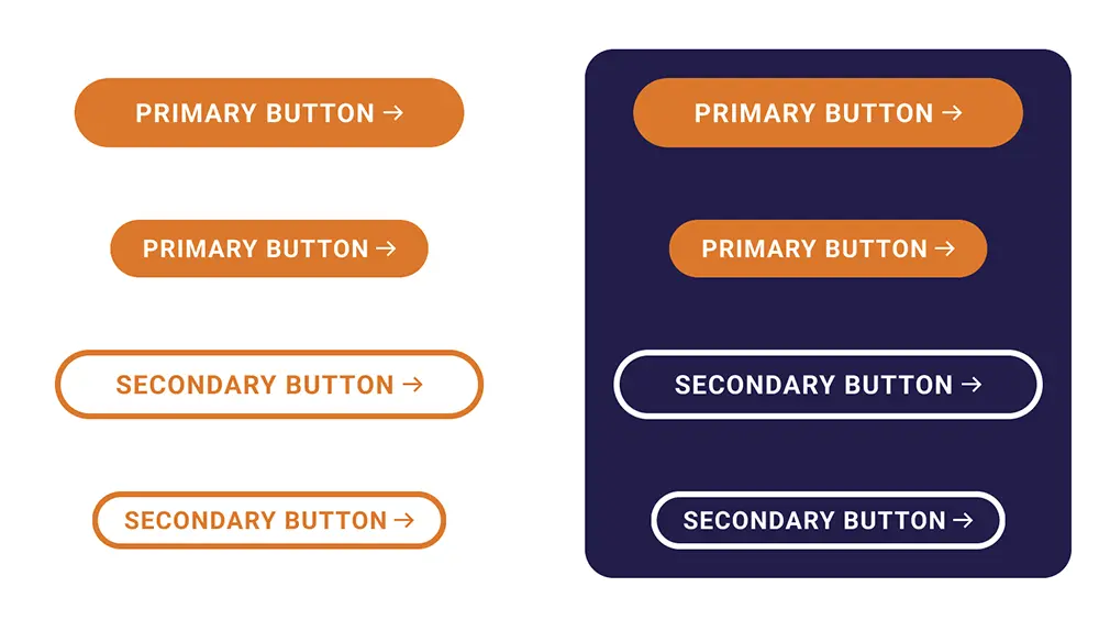
Button links
Buttons should be pill-shaped, with white text over orange.
When a secondary button style is needed, the fill should be clear with orange text and outlines for white backgrounds, and white text and outlines for dark backgrounds.
Colors
Use the colors listed in our color palette page. See below for more guidelines:
- Body copy should be black (#090015) over white background
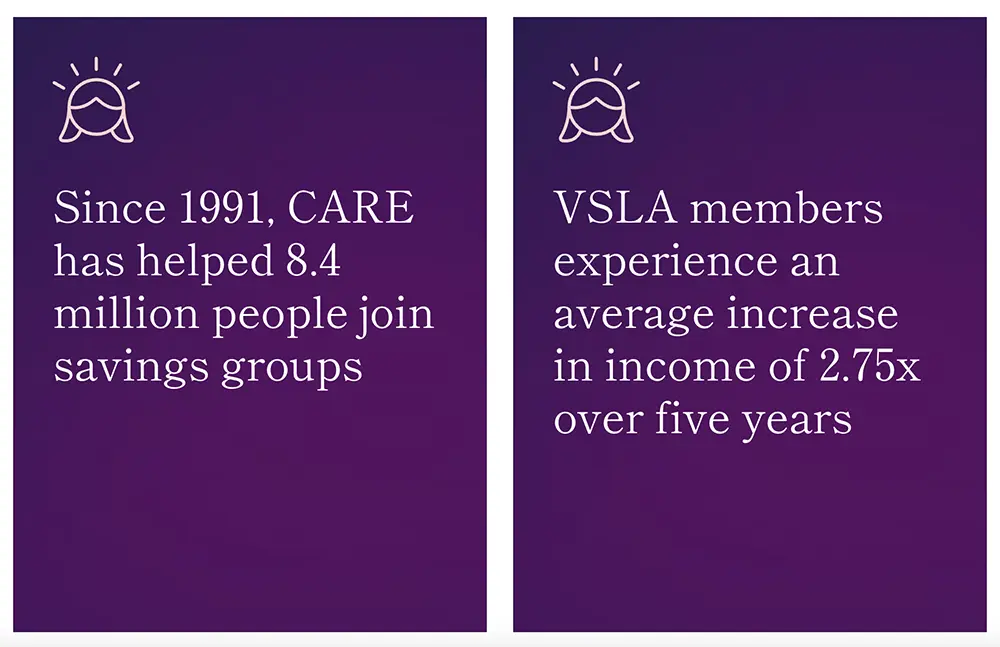
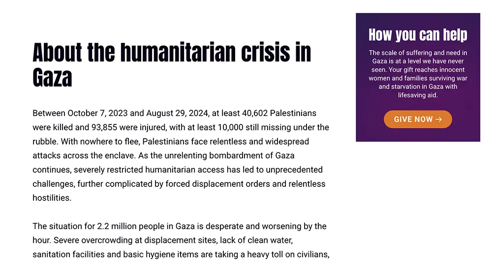
- Supplementary components can use black text over CARE's cream (#FFF8EE) or white text over CARE's indigo (#241E4E), purple (#5C2163), or dark gradients
- Orange should be reserved for the CARE logo, buttons, and other linking elements
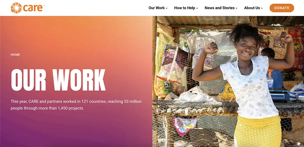
Header and navigation menus
The header style of a CARE site should be white with the horizontal orange CARE logo. Navigation text should use Roboto and follow in-line link styling.
If desired, a button can be used in the top right of the header for Donate or other CTAs.
Imagery
Photography
All photography should follow CARE's photo & video principles. See below for more web guidelines:
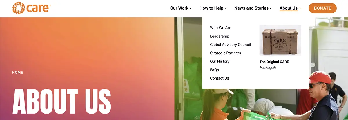
- Image size: Large images can slow down a site. Where possible, images should be formatted for web and should be <250 kb in file size. When downloading images from CARE Images, "Screen" option should suffice for most web uses.
- Format: Traditionally, most images uploaded to websites are JPEG or PNG format. WebP is a new file format option developed by Google, and is intended as a replacement for JPEG, PNG, and GIF file formats. WebP image files allow websites to display high quality images but at smaller files sizes, which helps webpages load faster.
- Alt text: Whenever uploading an image online, add alt text. Alt text is a description of an image that is displayed if the image cannot be loaded, or is read by screen readers for people with visual impairments.
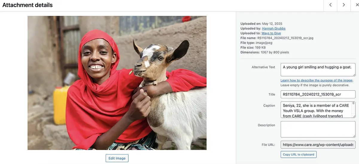
Circle of CARE
The Circle of CARE should be used sparingly on the site in order to achieve maximum impact. Areas we suggest using the Circle of CARE include the homepage and alongside messaging explaining CARE's work and encouraging people to donate.
