")
Brand Standards | Graphics Standards
Typography
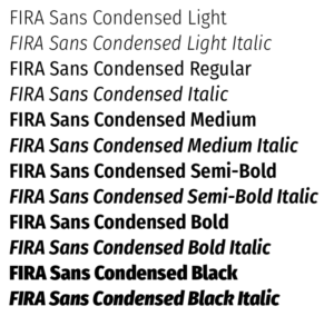
Primary typeface: Fira Sans Condensed
Fira Sans Condensed is CARE’s primary typeface. It’s a clean, modern sans-serif typeface that works well for display copy, callouts, captions and other uses. Pair it with Merriweather as the body copy for the best result in printed collateral. Digital programs can use only Fira if you prefer for ease of use.
NOTE: The Fira font has many weights, for flexibility in design. However, reserve the Light weight and the Black weight for minimal usage in design elements. Use the other weights consistently in body copy and headlines so all materials have the same look and feel.
You can download it from Google Fonts.
Sample sizing below for standard print use:
Headline
Fira Sans Condensed Bold
28pt
Subhead
Fira Sans Condensed Medium
18pt
Heading 1
Fira Sans Condensed Medium
14pt
Heading 2
Fira Sans Condensed Medium
11pt
Pici idersped earcil mostrum quodis idem as nature re il incium nis ute odi offici dolorep.
Fira Sans Condensed Regular
9pt
Recommended font selection:
DOWNLOAD
Fira Sans Condensed Font Family and
Installation Instructions
CARE employees and approved partners can contact brandsupport@care.org for the password to access downloadable materials.
Brand Standards | Graphics Standards
Typography
The Brandmark | Typography | Color Palette | Icons & Patterns | Social Media Icons | Email Design & Analytics | Email Headers & Cybersecurity | Email Signatures
Primary typeface: Fira Sans Condensed
Fira Sans Condensed is CARE’s primary typeface. It’s a clean, modern sans-serif typeface that works well for display copy, callouts, captions and other uses. Pair it with Merriweather as the body copy for the best result in printed collateral. Digital programs can use only Fira if you prefer for ease of use.
NOTE: The Fira font has many weights, for flexibility in design. However, reserve the Light weight and the Black weight for minimal usage in design elements. Use the other weights consistently in body copy and headlines so all materials have the same look and feel.
You can download it from Google Fonts.
Sample sizing below for standard print use:
Headline
Fira Sans Condensed Bold
28pt
Subhead
Fira Sans Condensed Medium
18pt
Heading 1
Fira Sans Condensed Medium
14pt
Heading 2
Fira Sans Condensed Medium
11pt
Pici idersped earcil mostrum quodis idem as nature re il incium nis ute odi offici dolorep.
Fira Sans Condensed Regular
9pt
Recommended font selection:
DOWNLOAD
Fira Sans Condensed Font Family and
Installation Instructions
CARE employees and approved partners can contact brandsupport@care.org for the password to access downloadable materials.
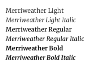
Body Copy font & for Editorial-Style Publications: Merriweather
A serif font has been selected for use as our body copy font and for publications that need to have an editorial style. This is meant to be used for body copy only. For example, it can be used on a news style publication to have a similar editorial feel to the New York Times and Washington Post. The first choice for headlines and call-outs should always be to use the Fira Sans Condensed font family.
Body copy size should ideally range between 11pt - 14pt depending on the print or digital application.
DOWNLOAD
Merriweather Font Family
CARE employees and approved partners can contact brandsupport@care.org for the password to access downloadable materials.
Alternate Digital Font: Arial
Font Stacks for Web and Digital Apps That Do Not Allow Font Customization
In some applications it is not possible to use our brand fonts. For example, in email marketing services like Luminate, Constant Contact, Mail Chimp and Marketing Cloud only font stacks are available for HTML use. In this case use this font stack:
Sans-serif: Arial, Helvetica Neue, Helvetica, sans-serif
Microsoft Office Applications:
Sample sizing below for Arial:
Headline
Arial Bold
32pt
Subhead
Arial Bold
28pt
Heading 1
Arial Bold
22pt
Heading 2
Arial Bold
16pt
Hyperlink
Arial Regular
16pt
Body text:
mostrum quodis idem as nature re il incium nis ute odi offici dolorep.
Arial Regular
16pt